
How I created a simple and authentic interface language for an entire line of kitchen appliances
CLIENT
OXO
LENGTH
2012 – 2015
CONSULTANCY
Smart Design
MY ROLE
Interface Lead
THE BRIEF
“We need interfaces just as easy-to-use and modern as what the OXO brand stands for.”
SUMMARY
OXO, a cooking tools and housewares brand, is known for innovative products of excellent usability and quality materials. It practices “universal design” philosophy, aiming to make products accessible by the greatest range of users, including those with disabilities.
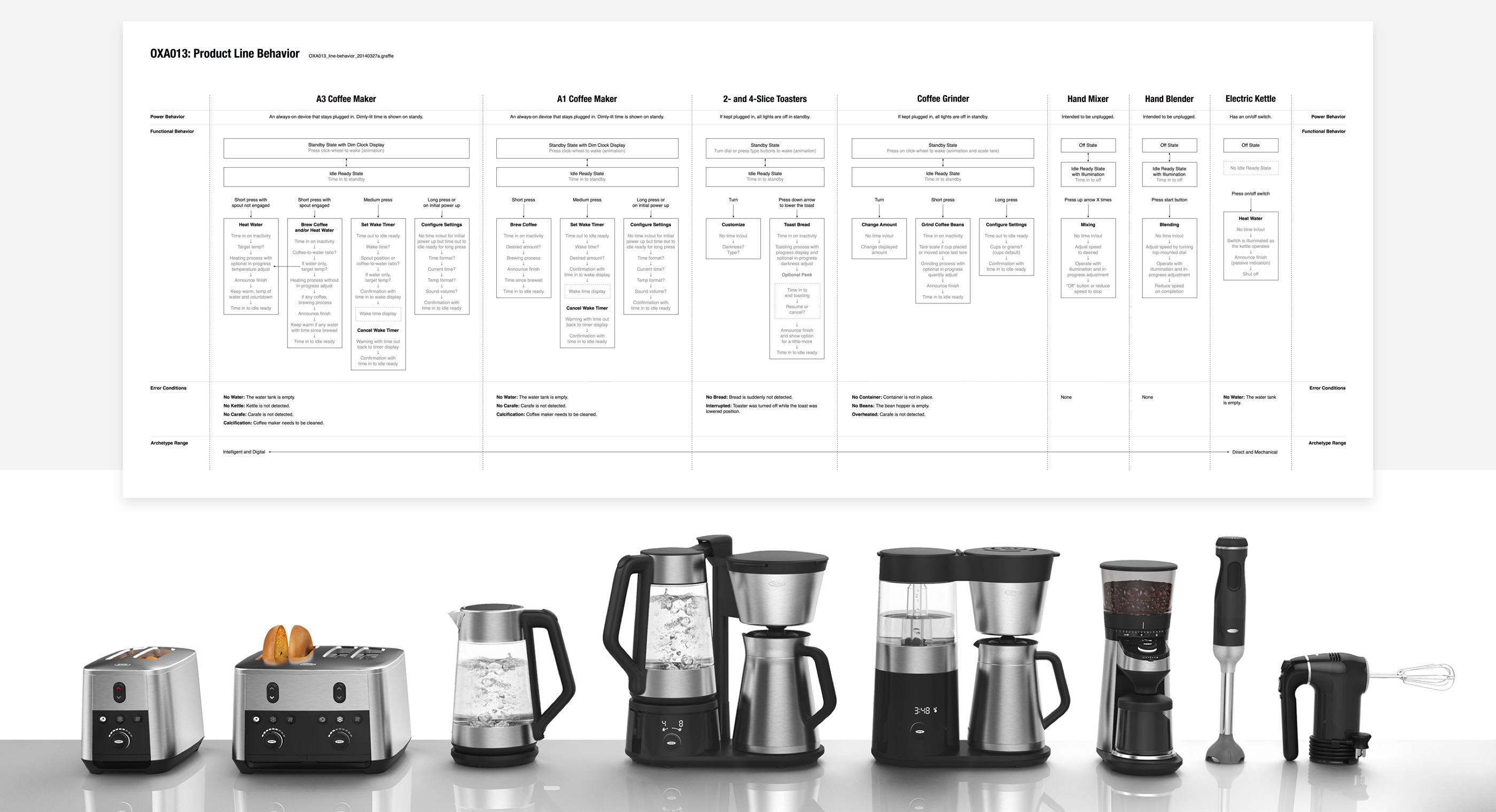
In 2012, OXO decided to create its inaugural line of kitchen appliances. Multiple design teams embarked on the initial set of eight products. My task was to design user interfaces for each OXO product, while ensuring that they all speak a cohesive, proprietary, and authentic language.
OUR TEAM
Creative director
Category managers
Industrial designers
Interface lead – me
Mechanical, electrical,
and firmware engineers
MY ROLE
Interface design
Interactive prototyping
User validation testing
Engineering specifications
Manufacturing support
EXPLORATION
Ongoing prototype testing provided welcome guardrails for a wide range of concepts.
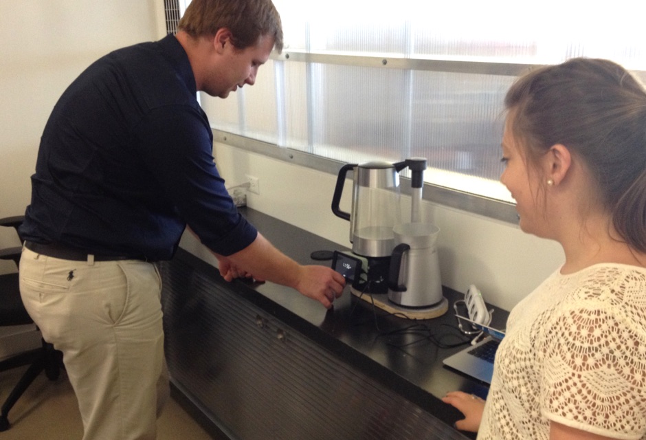
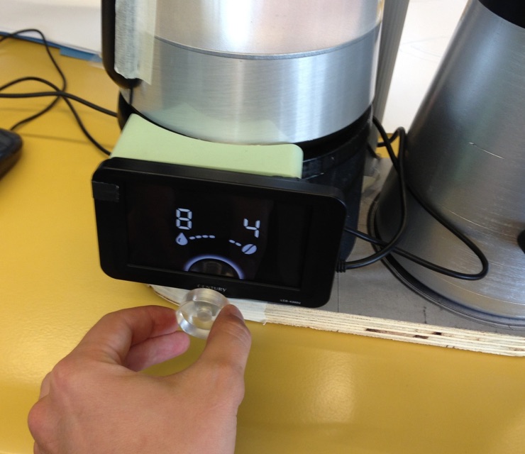
The process began with collaborative team discussions and brainstorming. I designed and programmed several iterations of prototypes to help my colleagues evaluate ideas by experiencing them firsthand.
As our design vision sharpened over time, the prototypes became progressively more detailed and considerate of edge cases.
We conducted user testing at regular intervals. In addition to validating general usability, we gained insights into users’ perceptions and associations. Some, for instance, mentioned the similarity to camera controls.
DIRECTION
I defined a set of principles to help unify the experience across every appliance in progress.

Simplicity of a single button
Every feature is accessible using one point of interaction
Cohesive communication of prompts and current state
Accelerated interaction through reduced hand movement

Intuitive to learn and quick to use
Icon-based interface is internationally compatible
Consistent approach to initial out-of-box configuration
Familiar interaction patterns from consumer electronics
Opportunistic use of surfaces for printed instructions

Intelligent, context- and usage-aware
Helpful, logically sequenced prompts
Unnecessary steps are automatically hidden
Last used settings are remembered for faster re-use

Personality through rich feedback
Light behavior clarifies and reinforces user experience
Selection constraints are explained through animation
Hidden features are opportunistically announced and celebrated at appropriate moments
REALIZATION
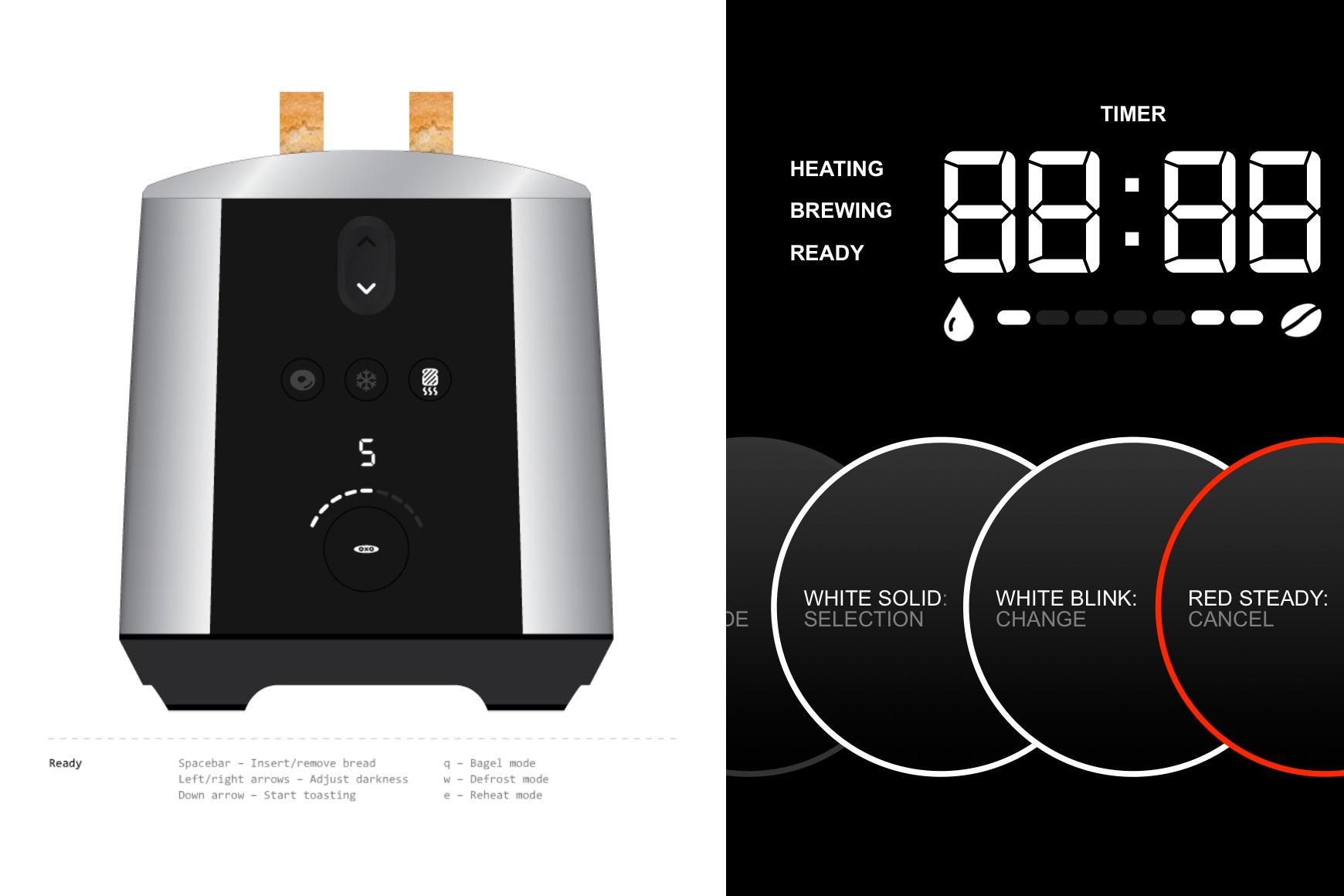
From illustrated scenarios and logic maps to a custom typeface, I attended to every detail.
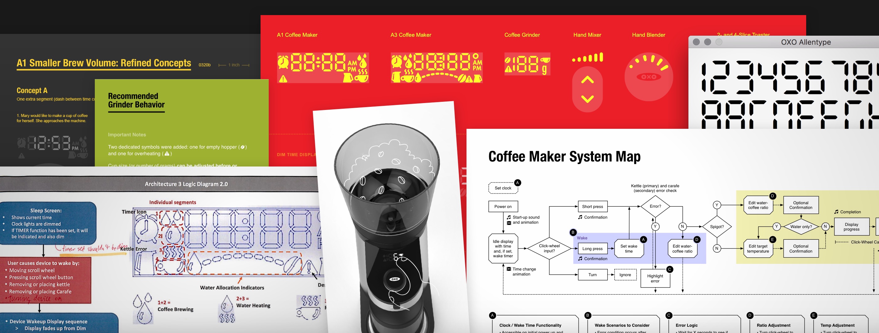
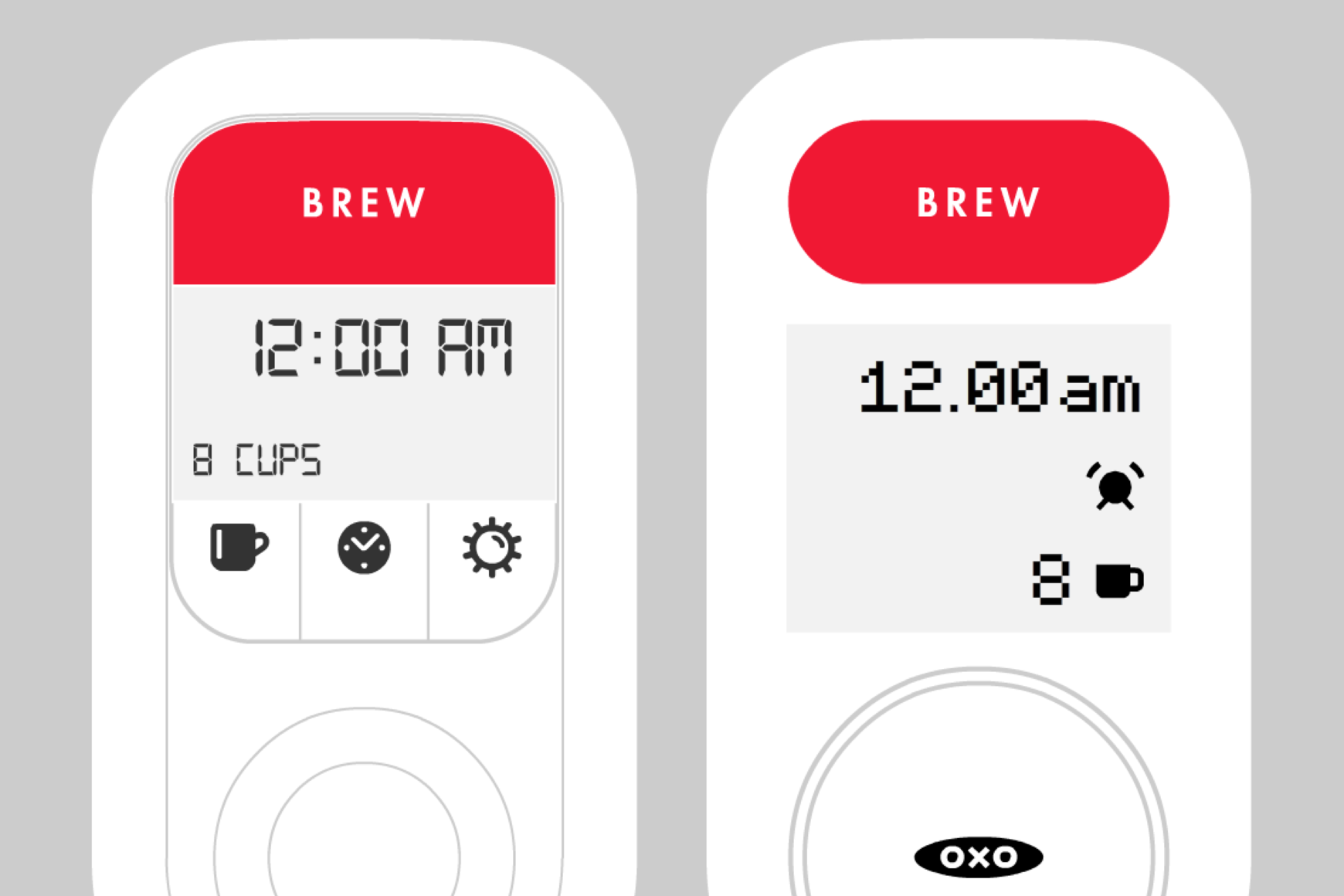
A behavior map ensured consistent interactions across the product line, concurrently designed by different teams.
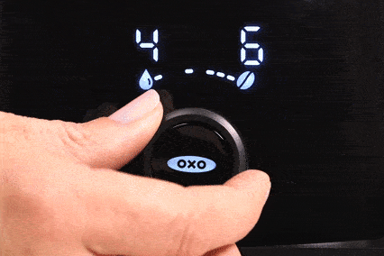
A signature interaction on the flagship coffee maker is the water-to-coffee ratio selection.
Products launched…
…and reviews poured in.
“1-button interface is deceptively simple to use (just follow its lead and don’t overthink it).”
— Jeffrey M.
“Once your preferences are dialed in, you are done and every use is simply a matter of pushing that little button from then on out.”
— Amazon Customer
“The single button control is a very nice touch, once you figure out the simple logic behind it.”
— Tom P.
“The Jetsons-age controls are simple and intuitive to use.”
— Amazon Customer
More by me.